Mobile Trading Redesign
Overview
My role
Design lead - UX resesarch, interaction design, visual design, prototyping
Team
Lead PM, PM, Design engineer
Cadence
Weekly check-ins to align and move project forward, turnaround time 3 month from concept to finalized design for execution
Background & Context
Charles Schwab’s mobile app is actively used by approximately 16% of their customers. The actual Trade tab & experience hasn’t been touched in 5 years at the company because there was an underlying assumption that this page is too important to make changes for the fear of interfering with muscle memory actions users have already established over the years. The former “Trade” PM, who is a consultant on this project views Schwab’s average user to be in their 50s, thus perpetuating even more inertia to change on this very important experience over the years. The current trade experience has both workflow problems as well as usability issues.
Persona & Research
Active trader vs active investor
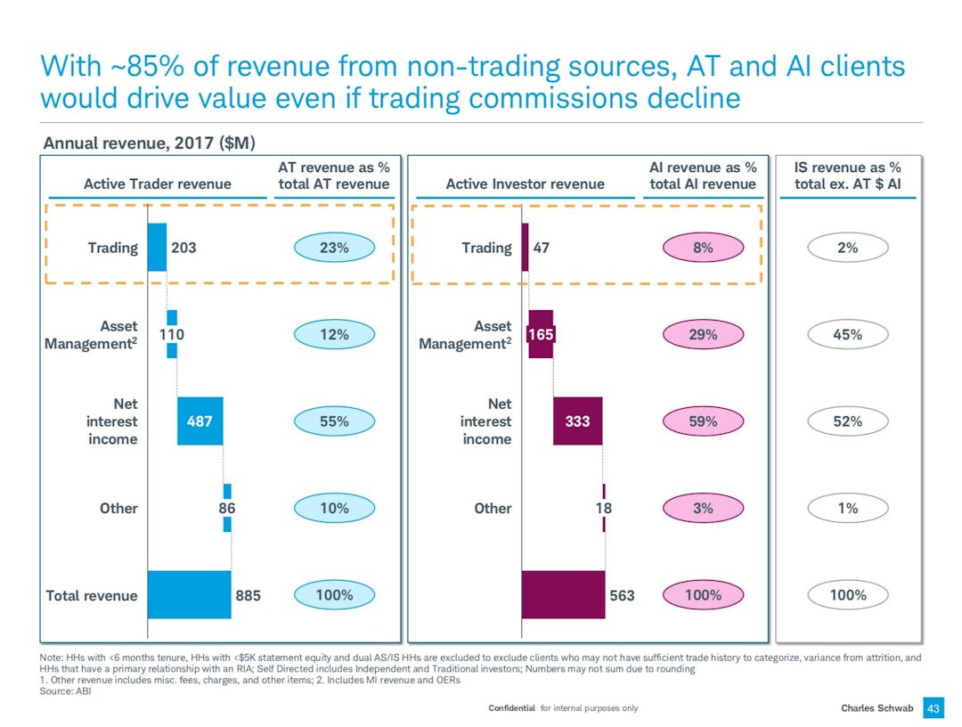
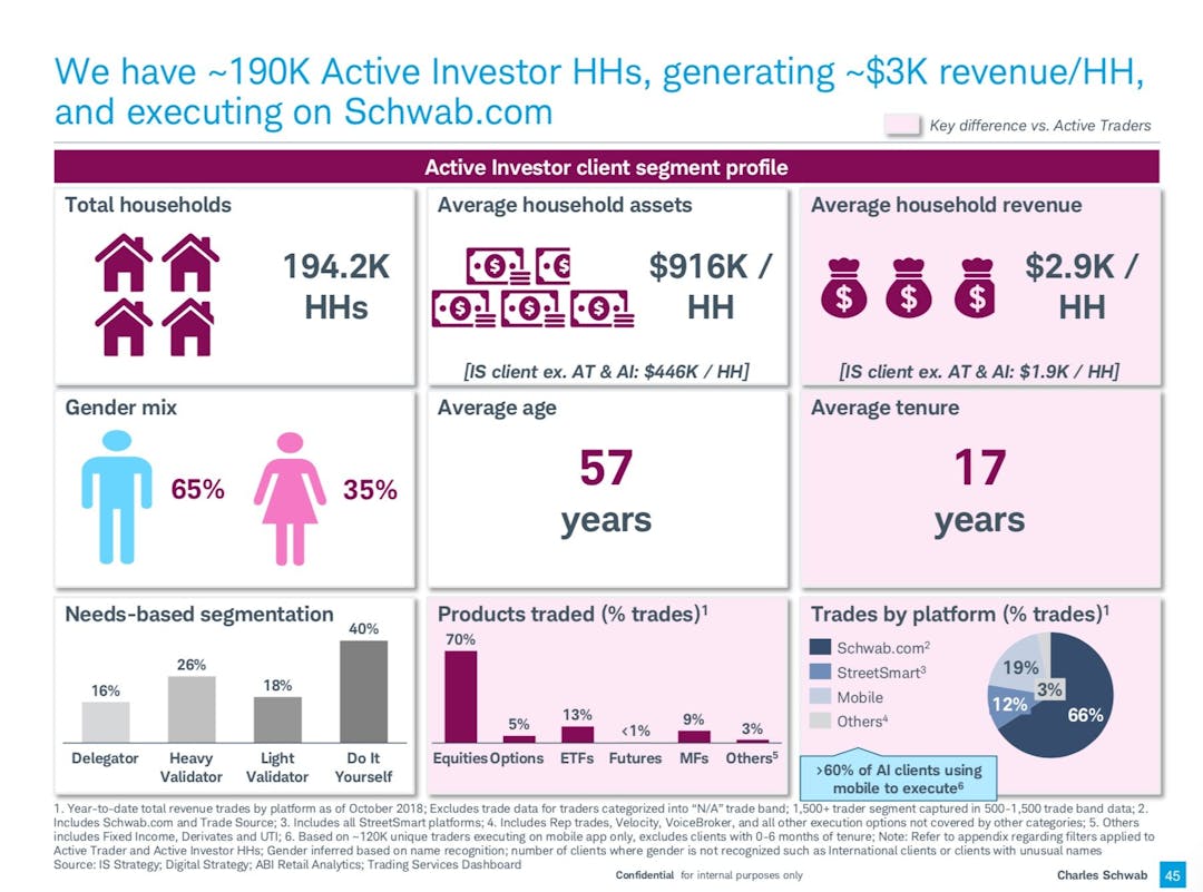
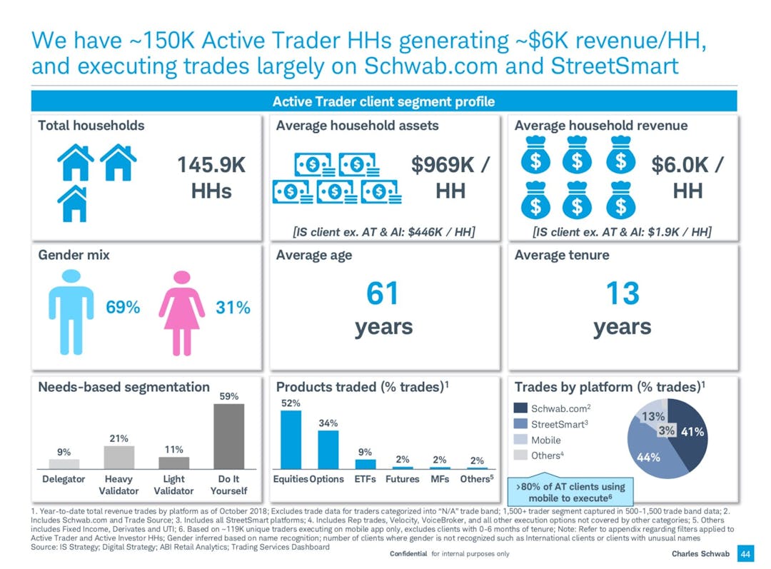
I first dug into the treasure trove of strategy docs from a year prior to understand overall company strategy, business objectives, and project scope. The overarching takeaway is the trade experience should be simple and intuitive for everyone, however Trader (higher volume) persona brings most amount of capital to Schwab as new customers and Schwab is increasingly focused on asset under management & interest as the primary source for revenue.
Digging into data
Looking into key device usage data to see which mobile screen size to prioritize. Iphone X maybe the 2nd most dominant in screen size, however it is also the fastest growing device and expected to surpass the most popular screen size soon.
AUDIT
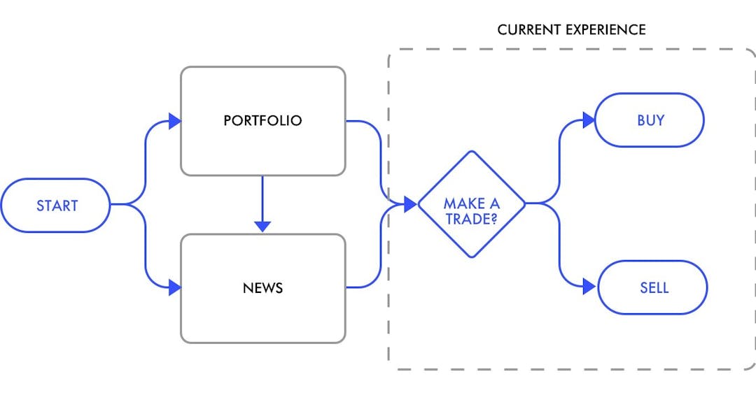
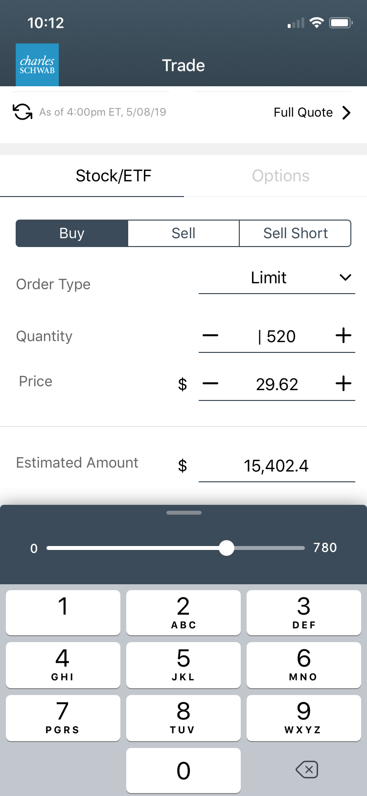
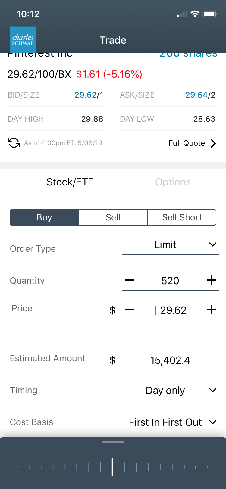
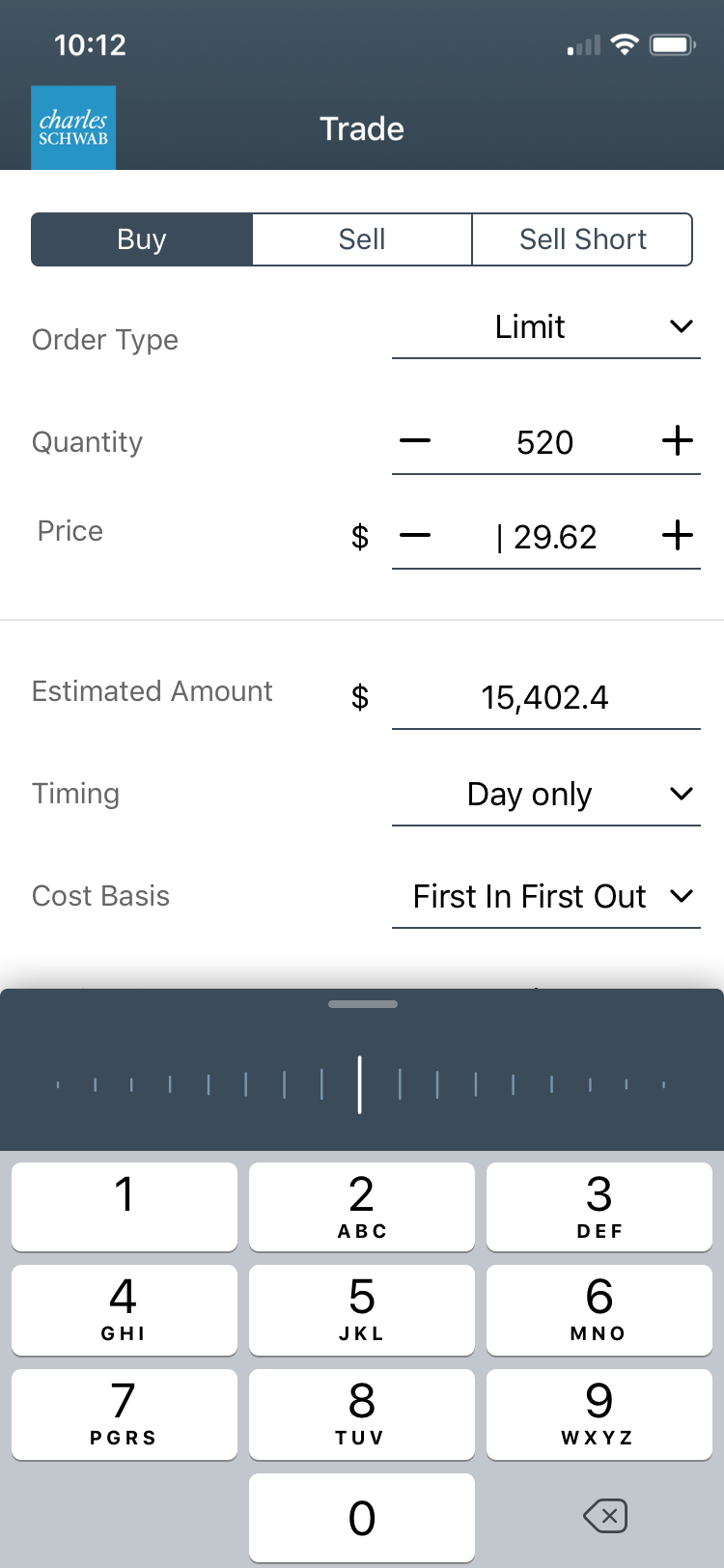
CURRENT EXPERIENCE AUDIT
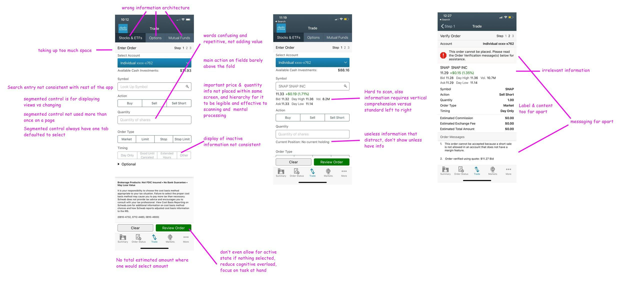
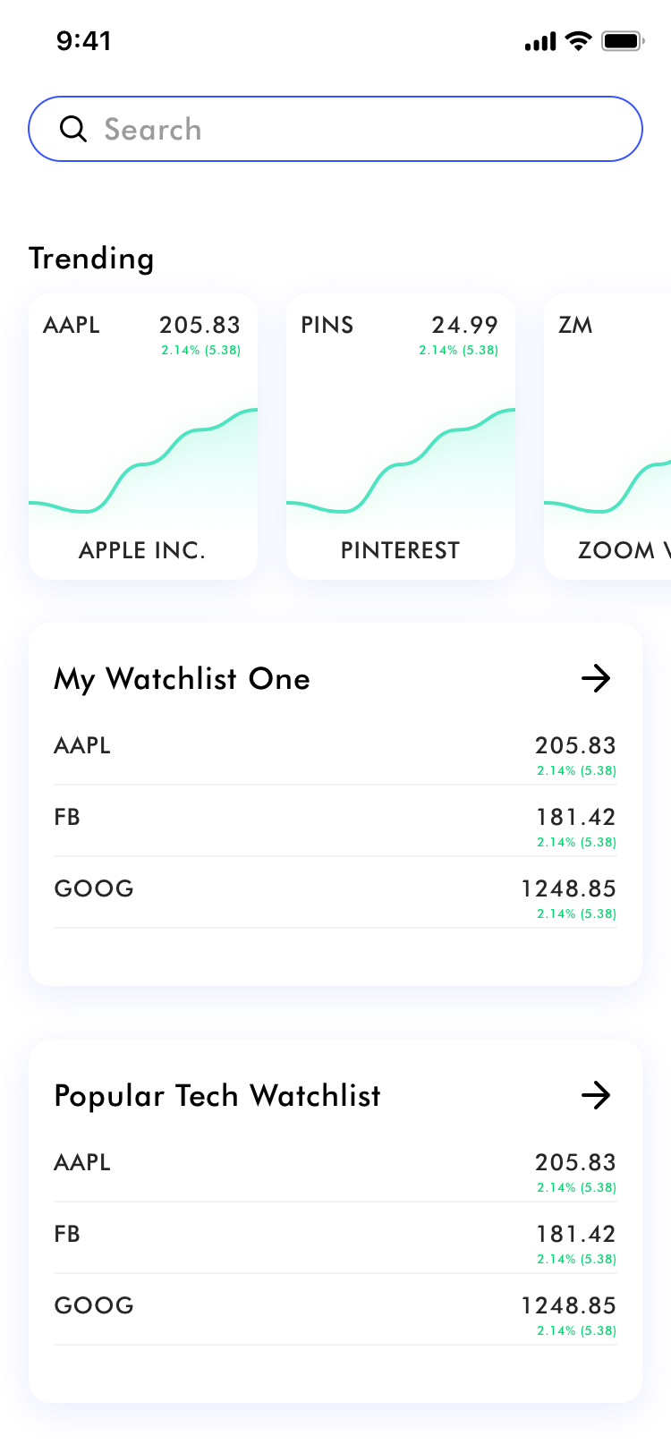
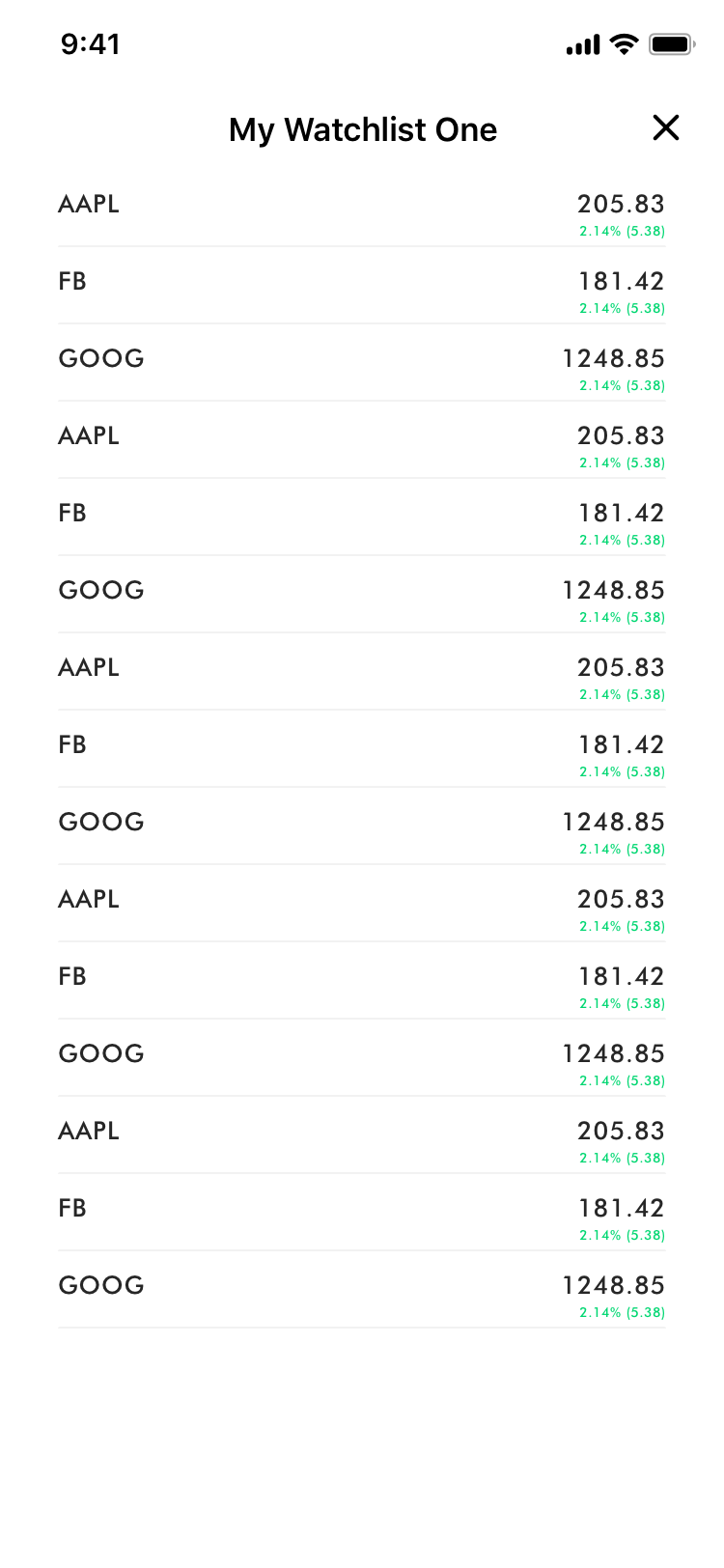
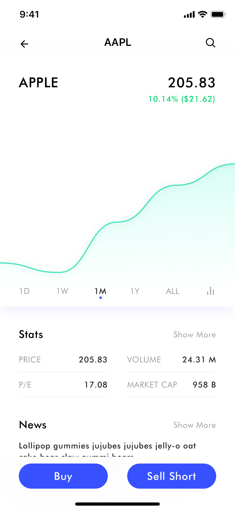
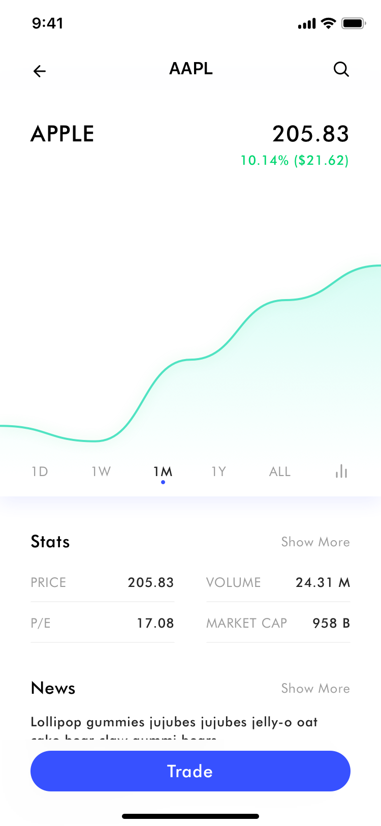
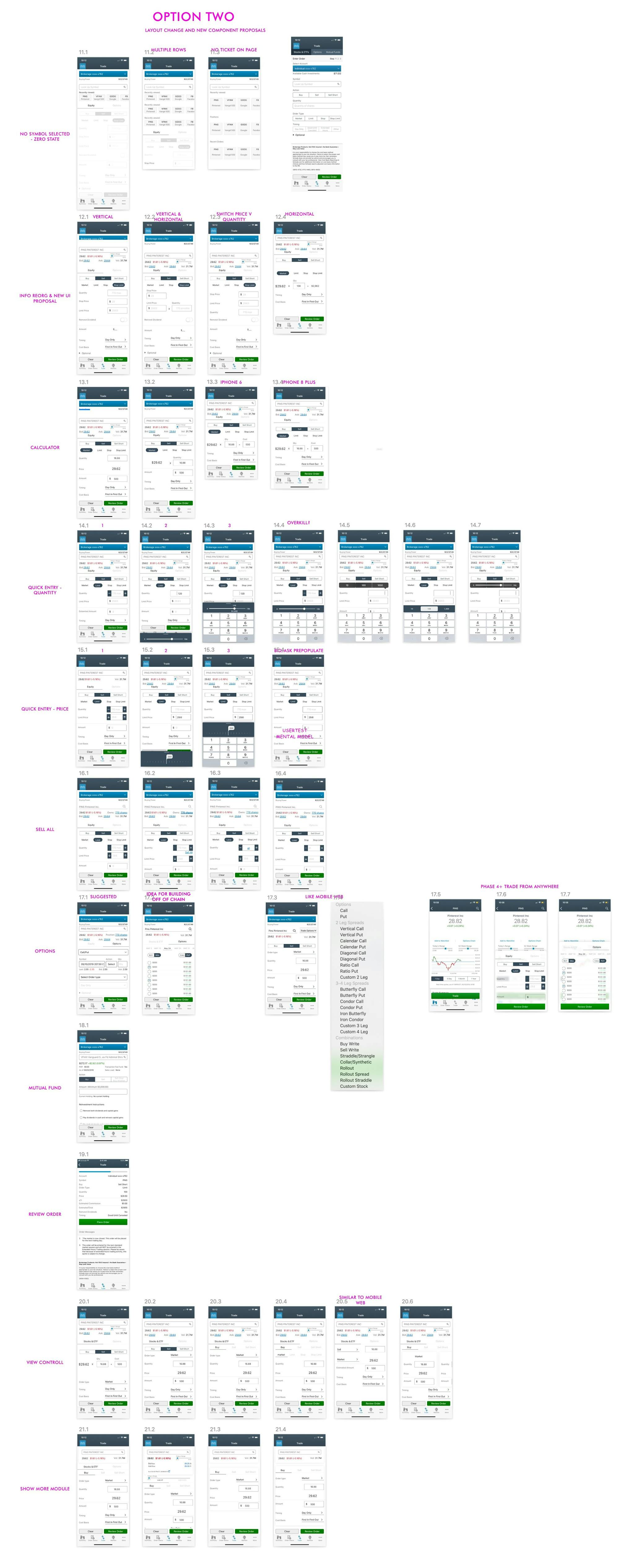
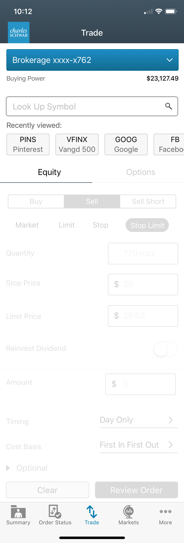
From a workflow perspective, the ideal workflow is user checking out momentum triggers either based on portfolio performance or breaking news, and from there be able to pull up relevant symbol and to initiate a trade pre-populated with symbol information. The current design puts an empty trade ticket front and center when a user would never want to arrive at a “checkout” without any items in “cart”.
From an information architecture perspective, Options are options of stock, thus belonging to a stock symbol versus parallel to a stock symbol. Pulling up a mutual fund would simply requires putting in the mutual fund symbol in place of a stock symbol thus would not require a separate “checkout” just for mutual fund.
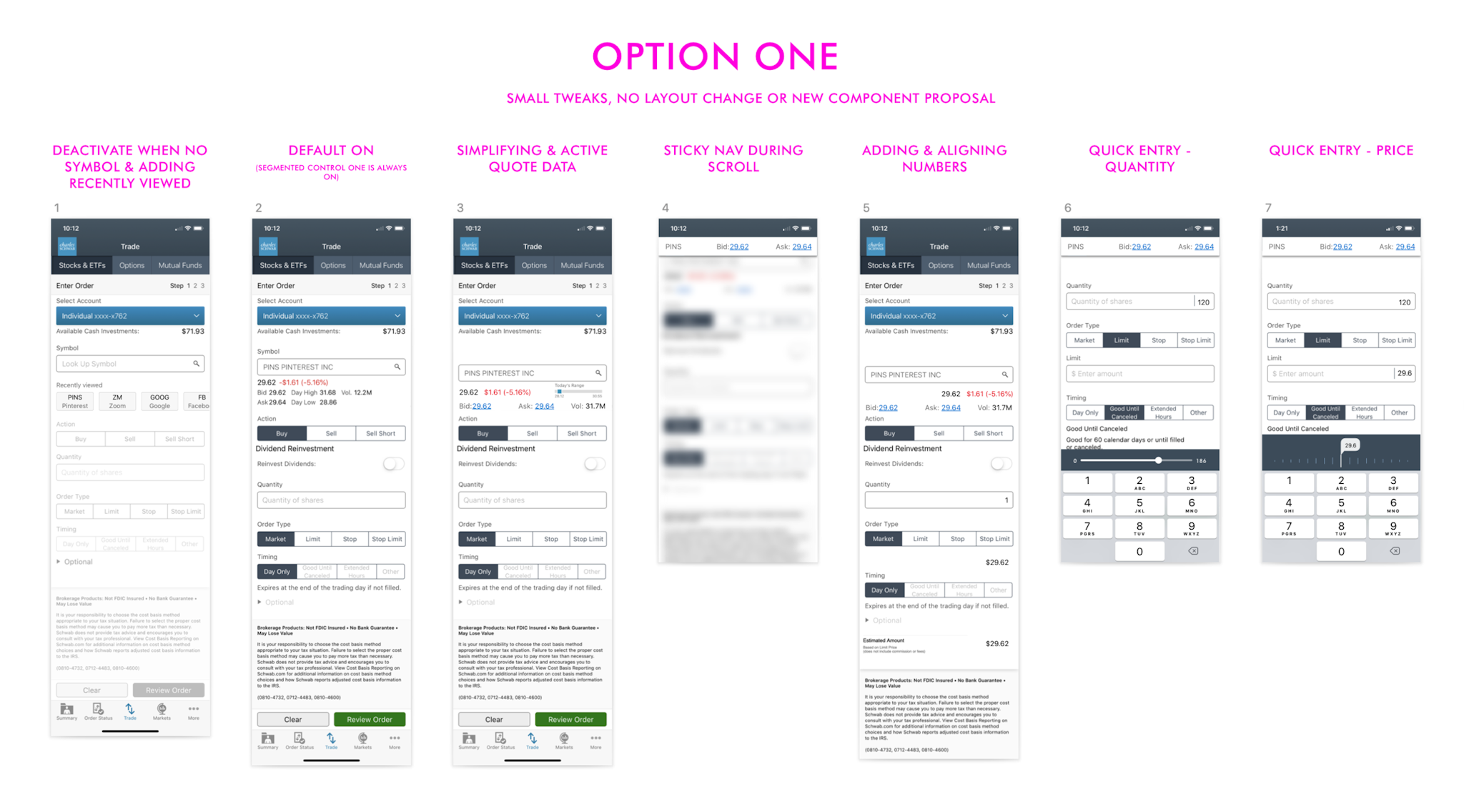
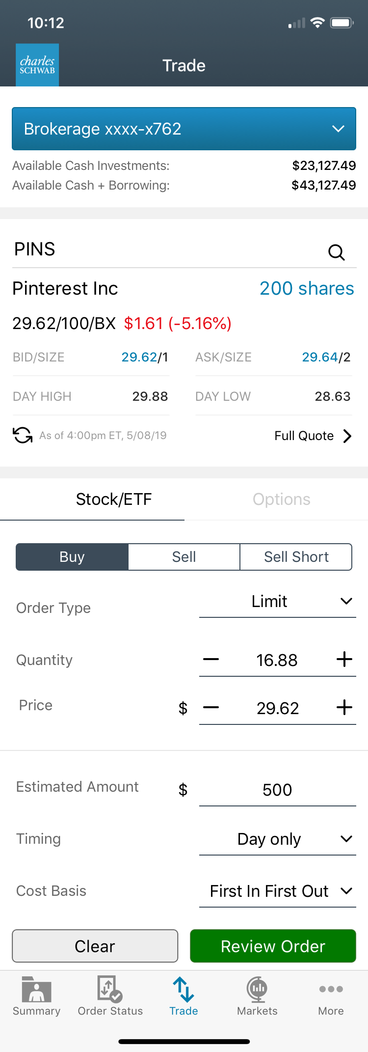
In terms of usability, the current experience requires scrolling to be able to have all key information in view for approximation. The display of information as well as content on page also exhibit inconsistent behavior and pattern, rendering confusion and illegibility.
North star & Strategy
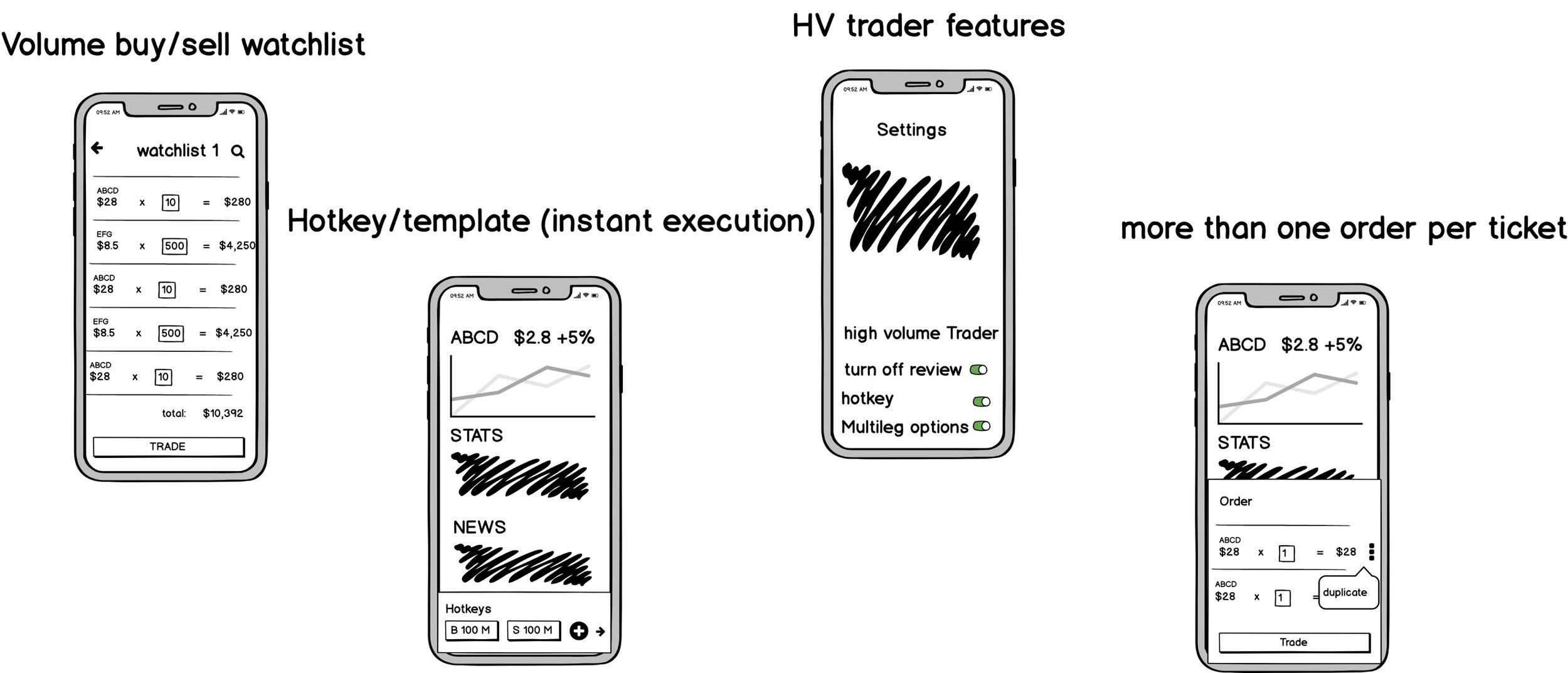
Active trader Concepts
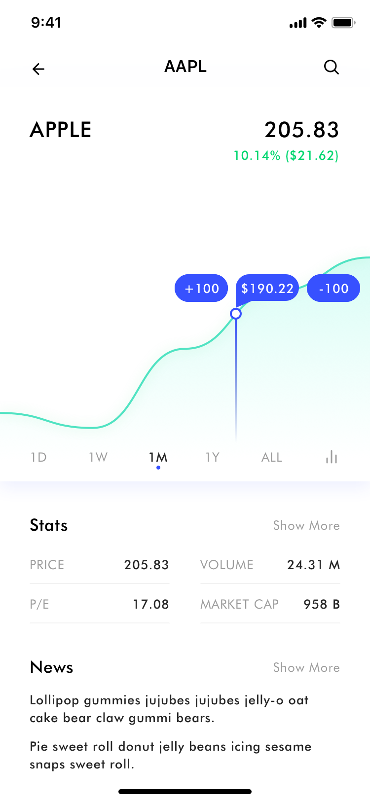
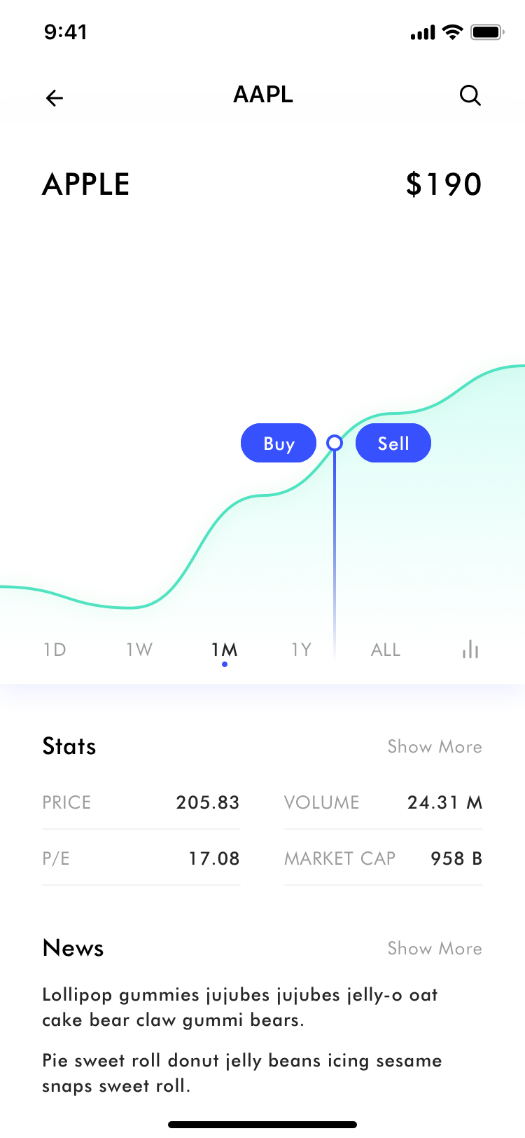
Generally at the beginning of my design process, I like to come up with North Star vision concepts to help drive, inspire, and set the tone for future product & designs.
Design objectives
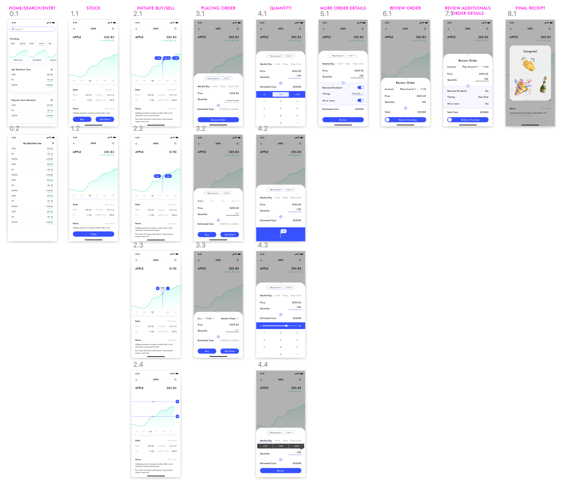
- Optimizing workflow
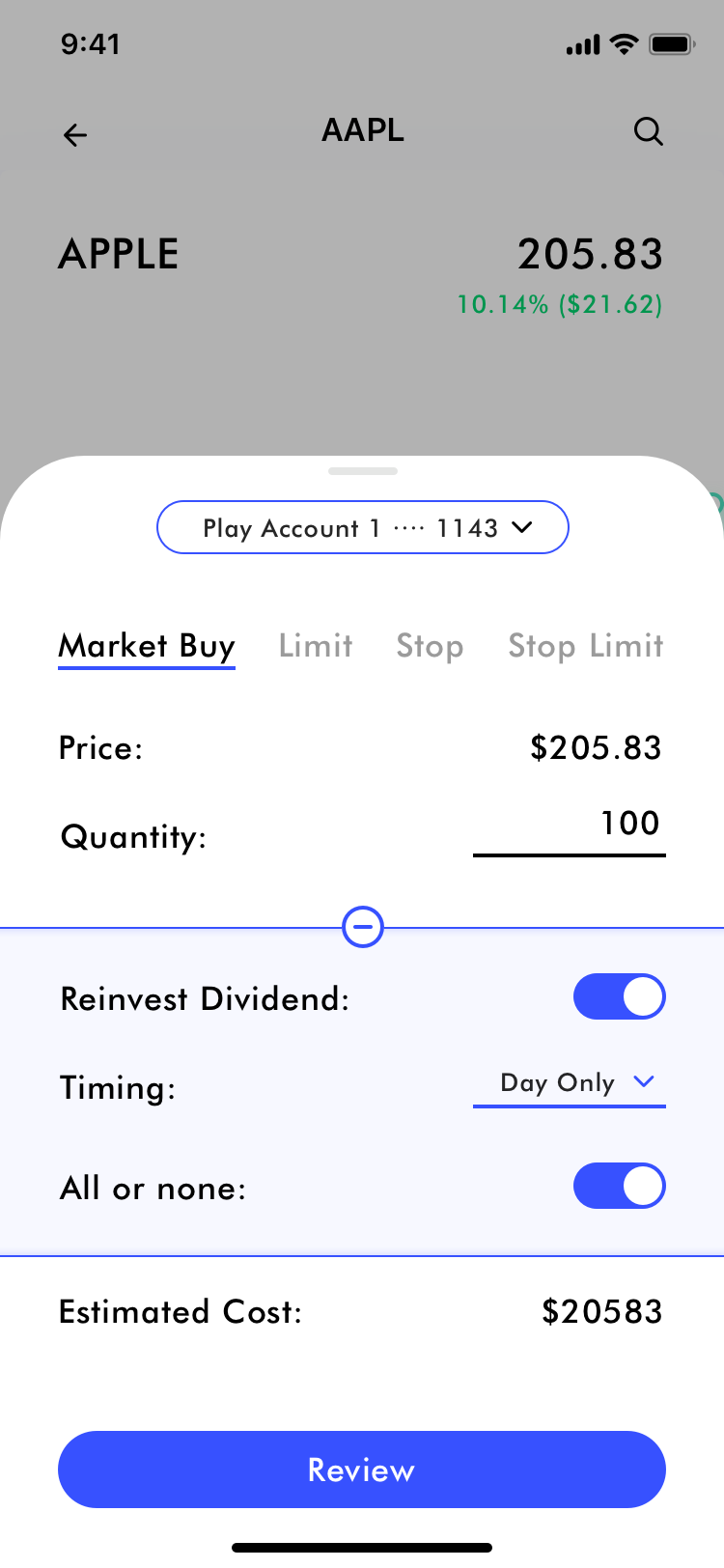
- Restructure important information architecture
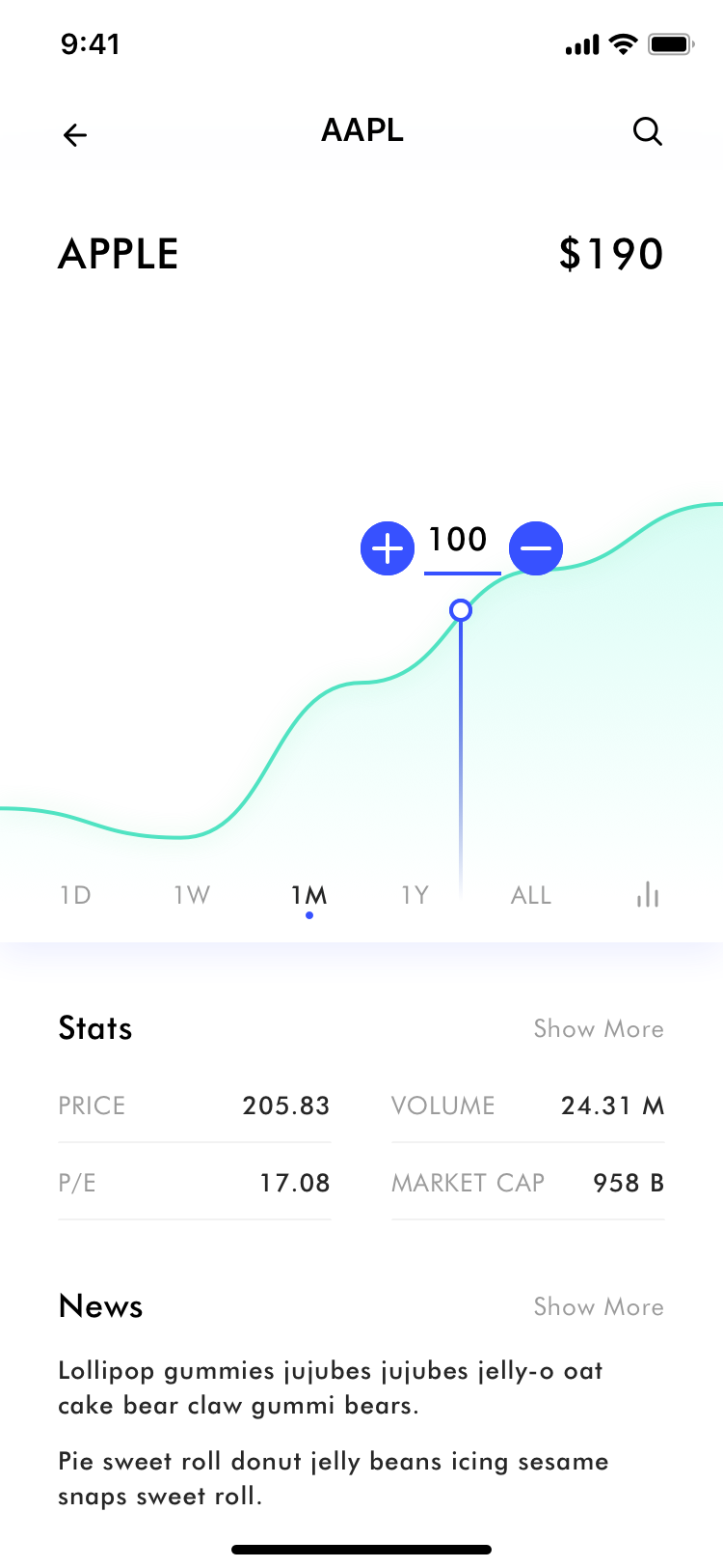
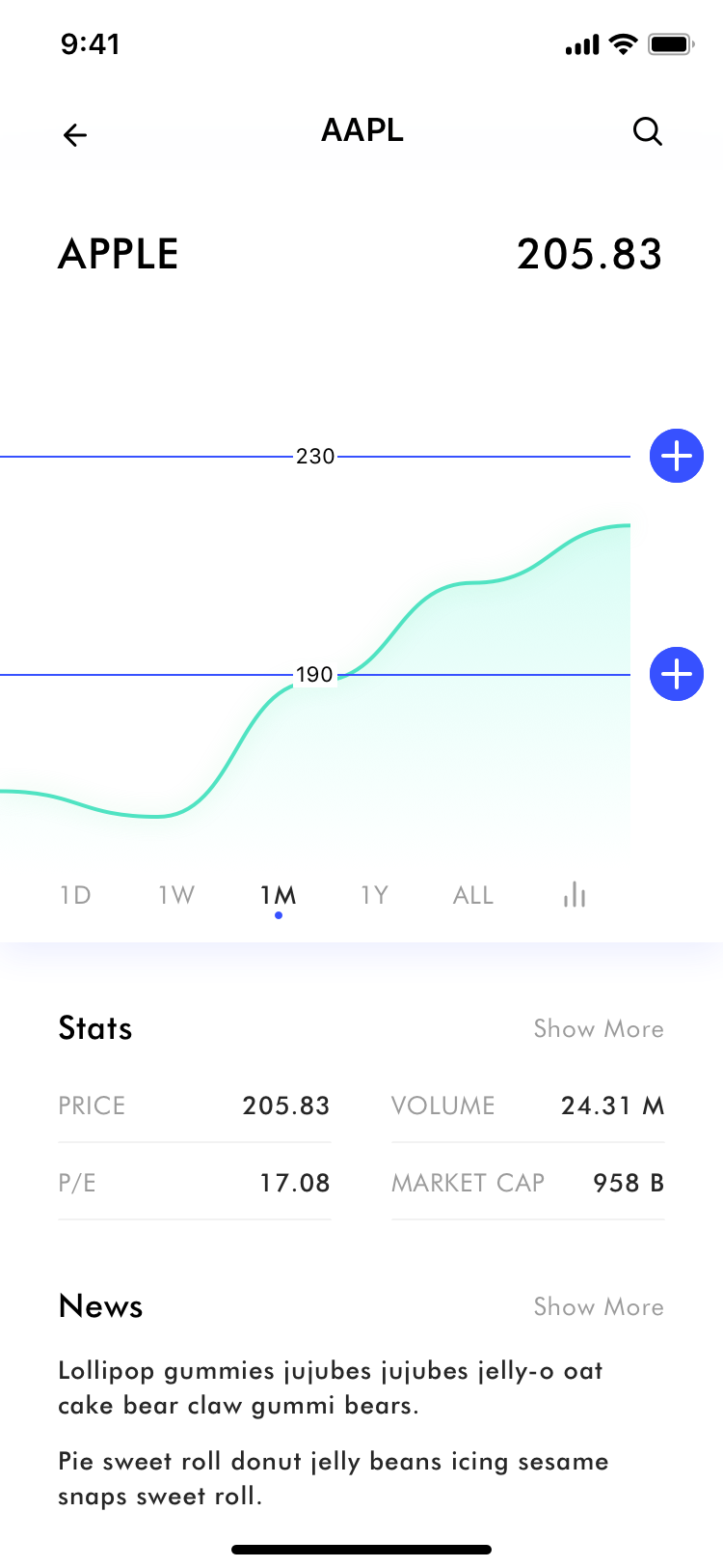
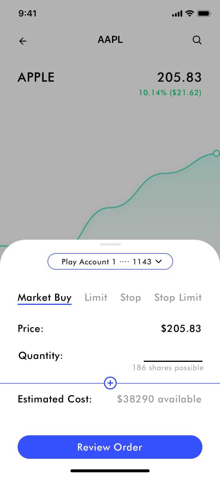
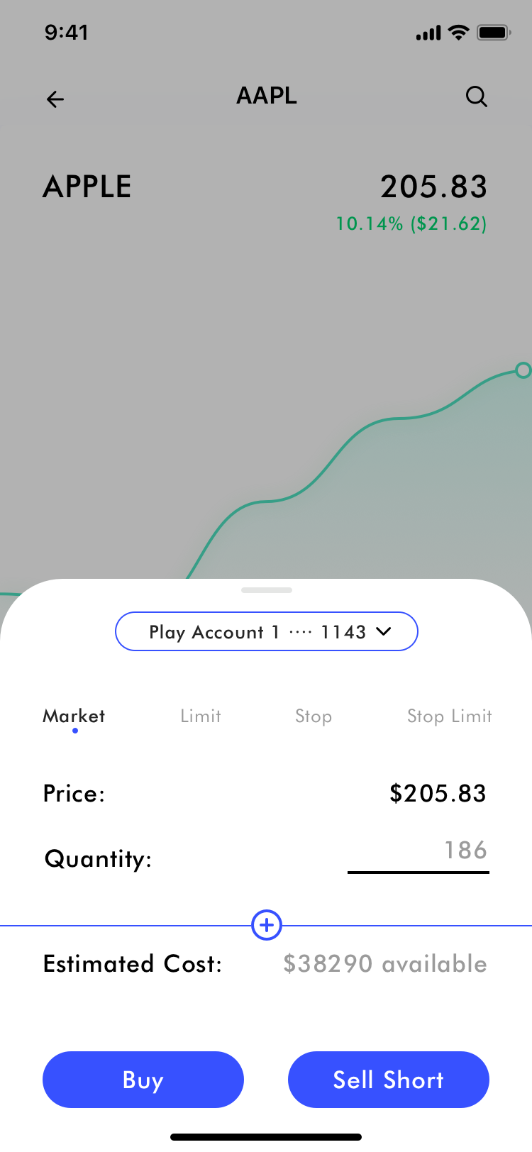
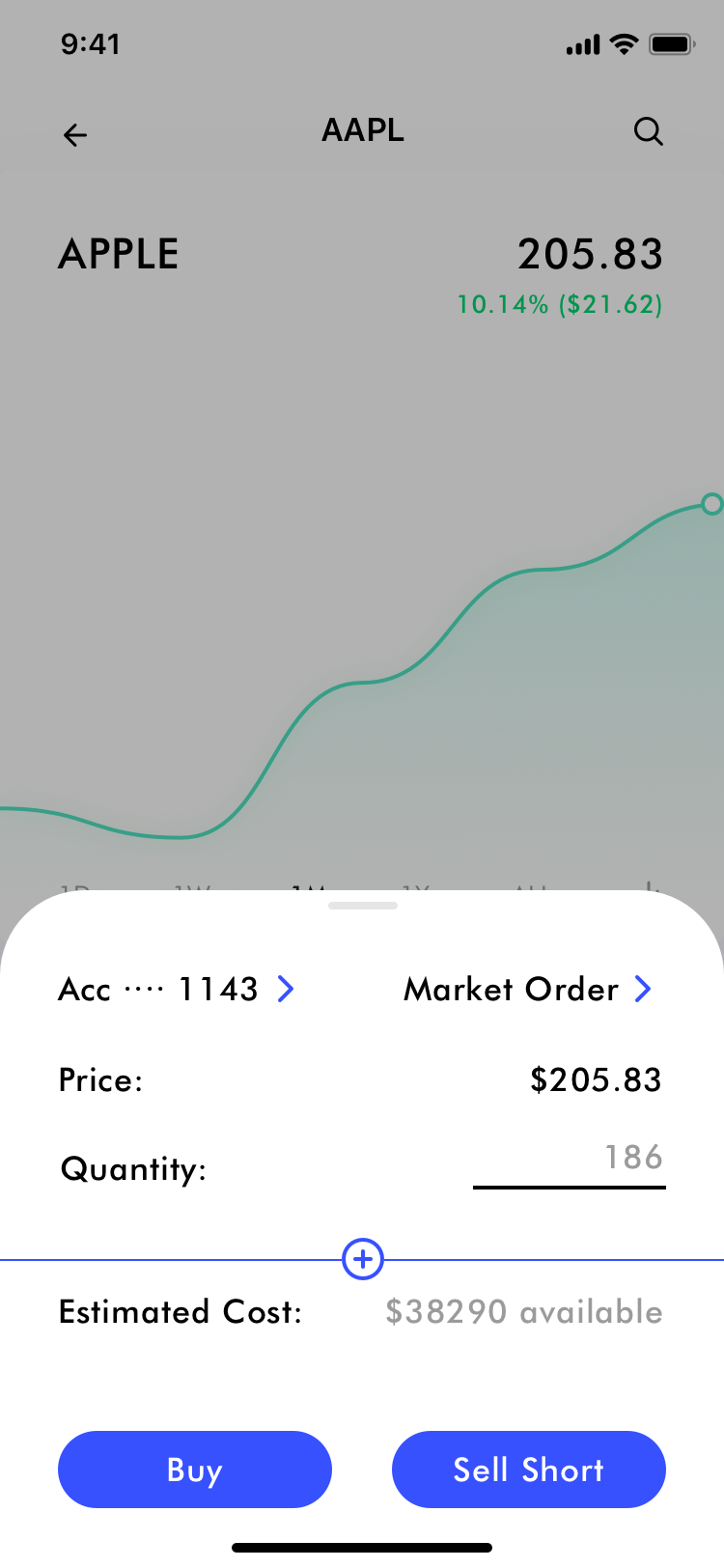
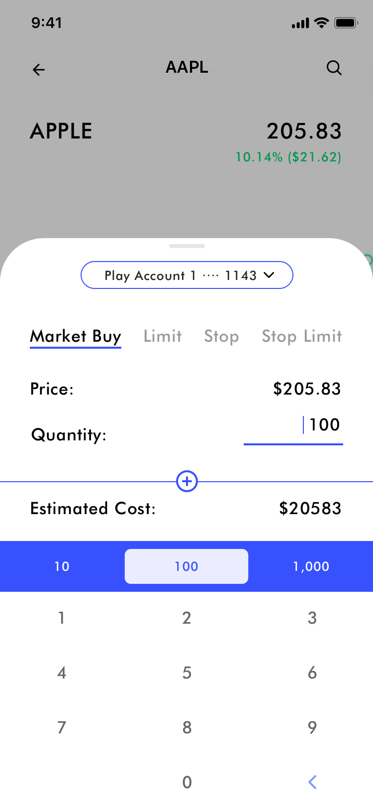
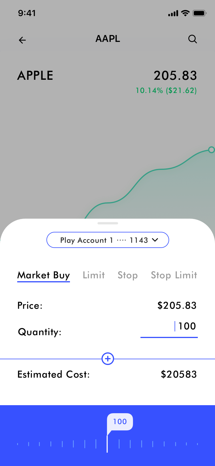
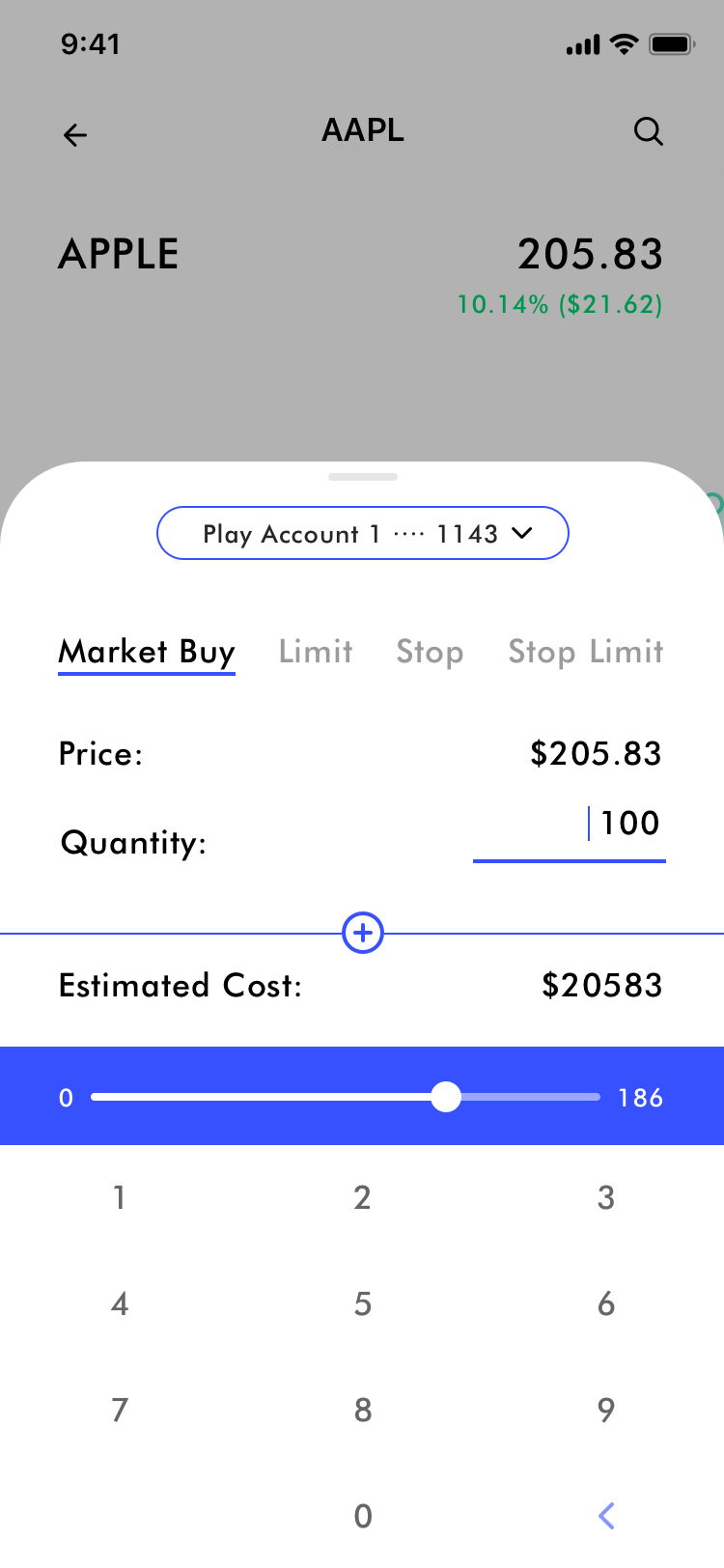
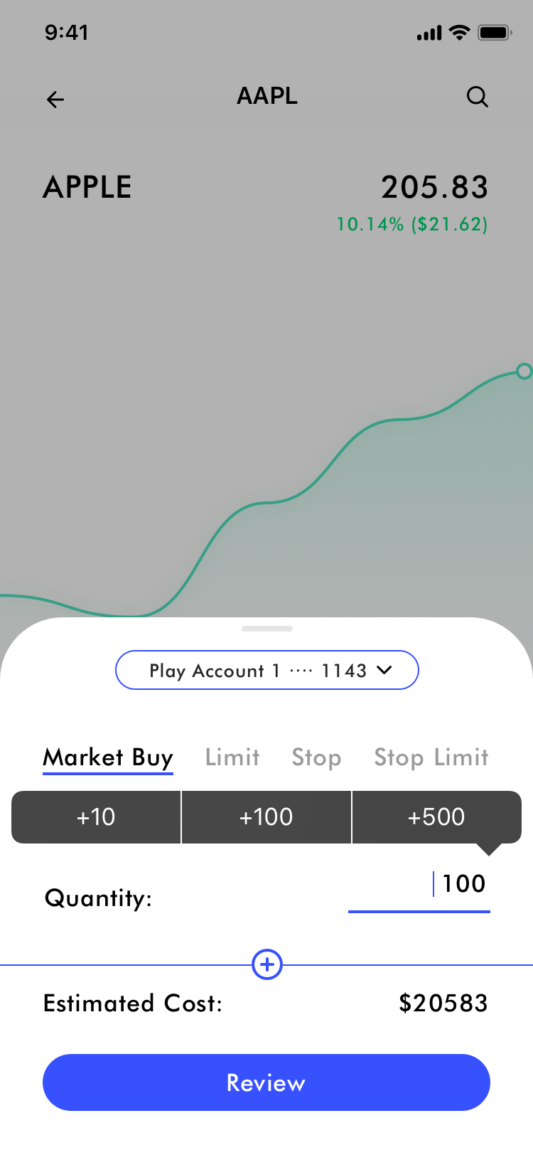
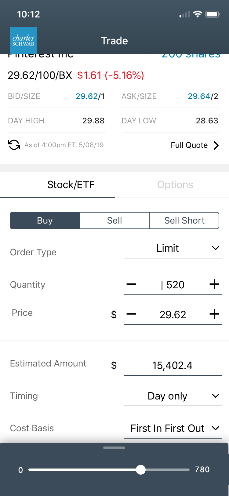
- Optimizing interactions of being able to change price & quantity quickly
- Optimize comprehension and legibility
- Adding in ability to help user calculate total
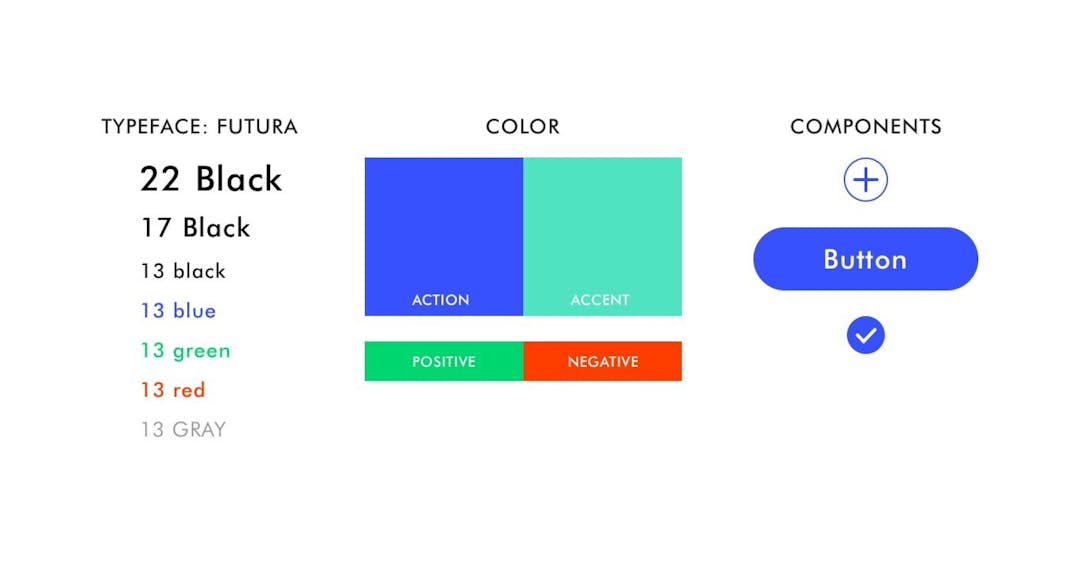
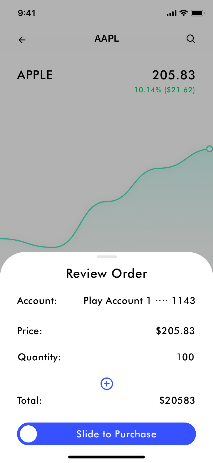
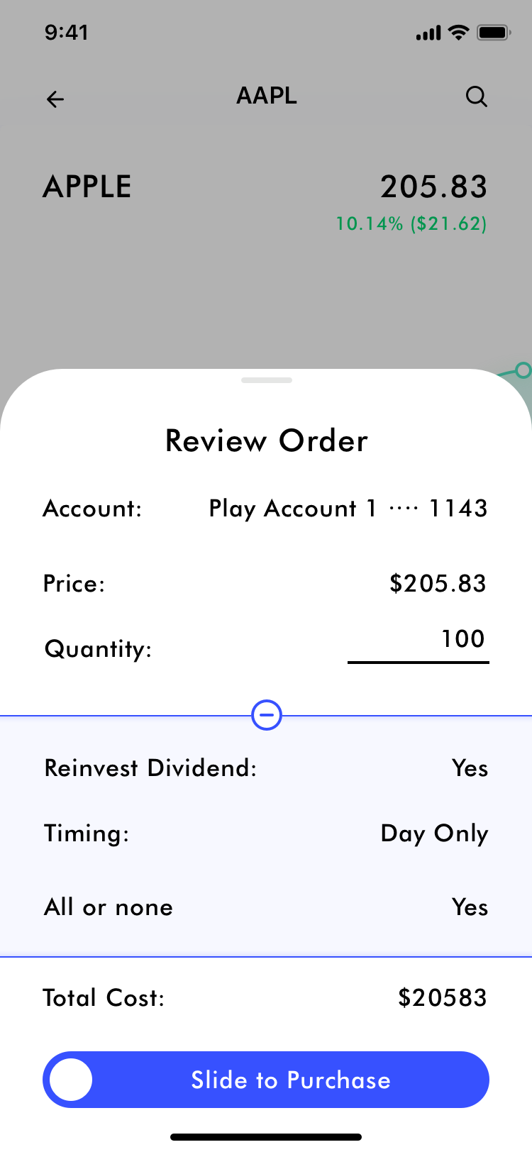
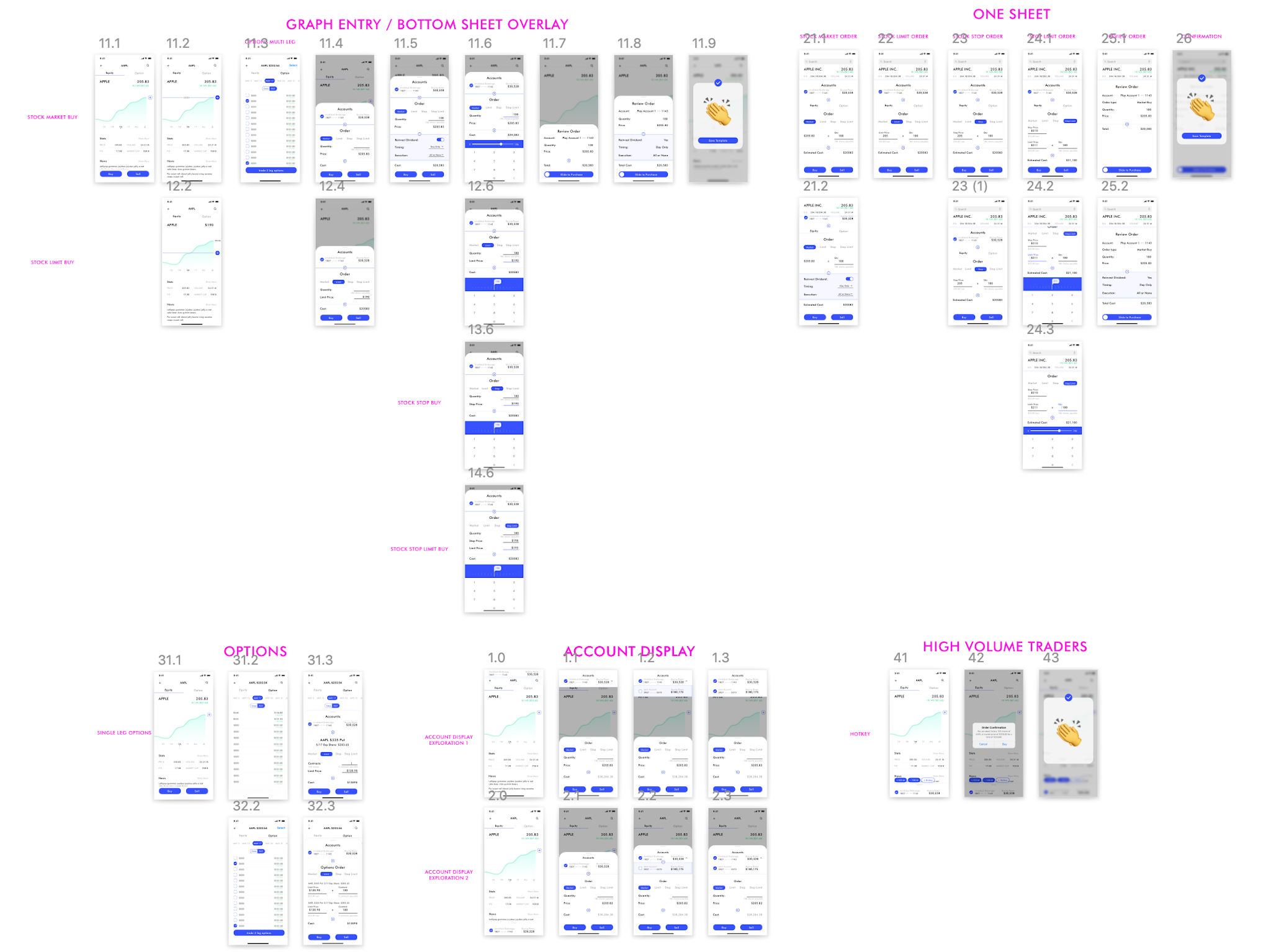
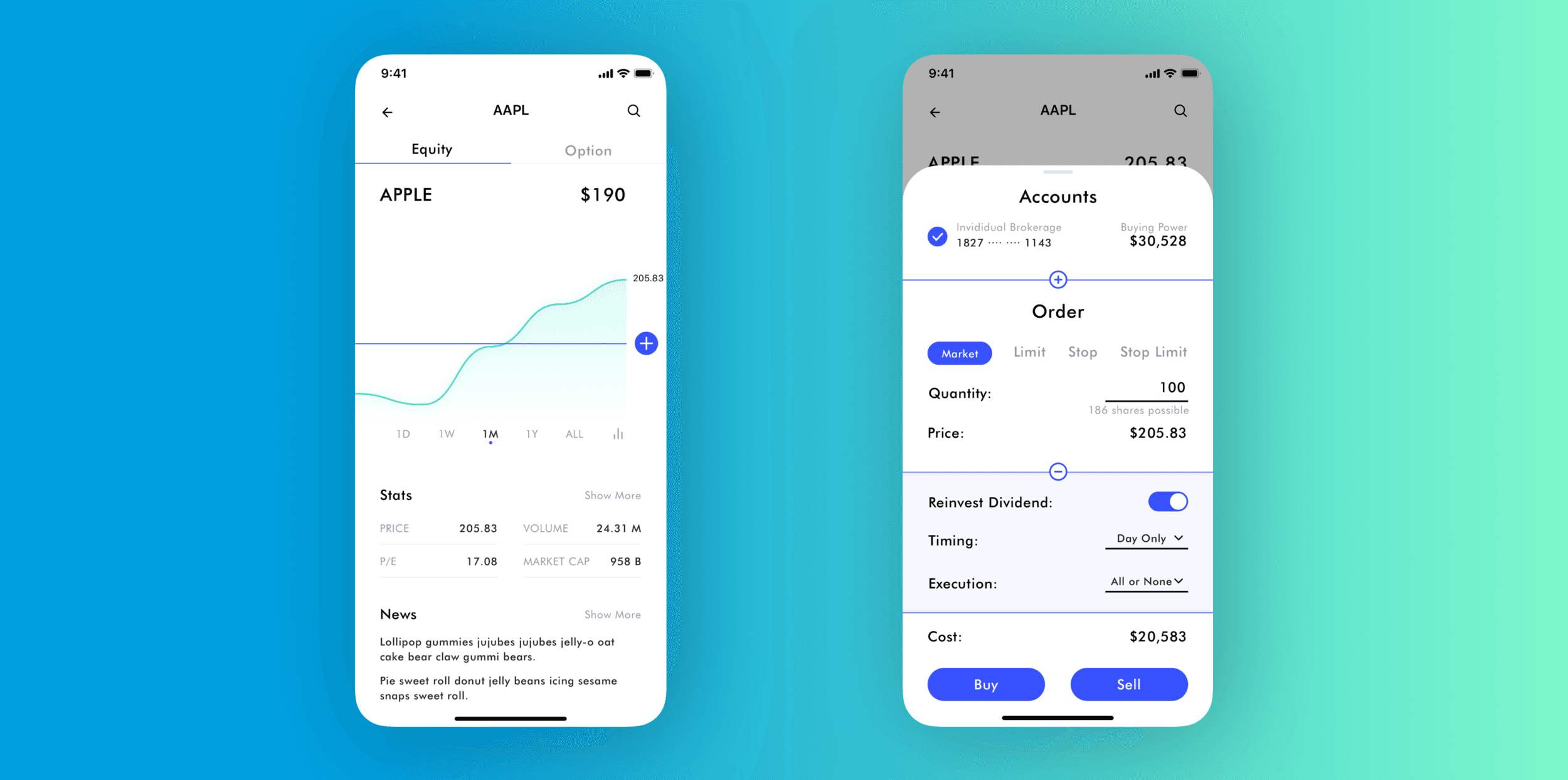
IDEAL FLOW & FRESH VISUAL DESIGN
As I am designing, I like to start by proposing idealistic explorations, then backtrack the design incorporating existing constraints. In this particular project, I created a new visual design system for the explorations, for the purpose of inspiring as well as lifting the design out of current experience allowing clearer view of the proposal.
